I thought this ad on an aerobridge recently was quite pertinent given the current tariff situation of the United States administration…
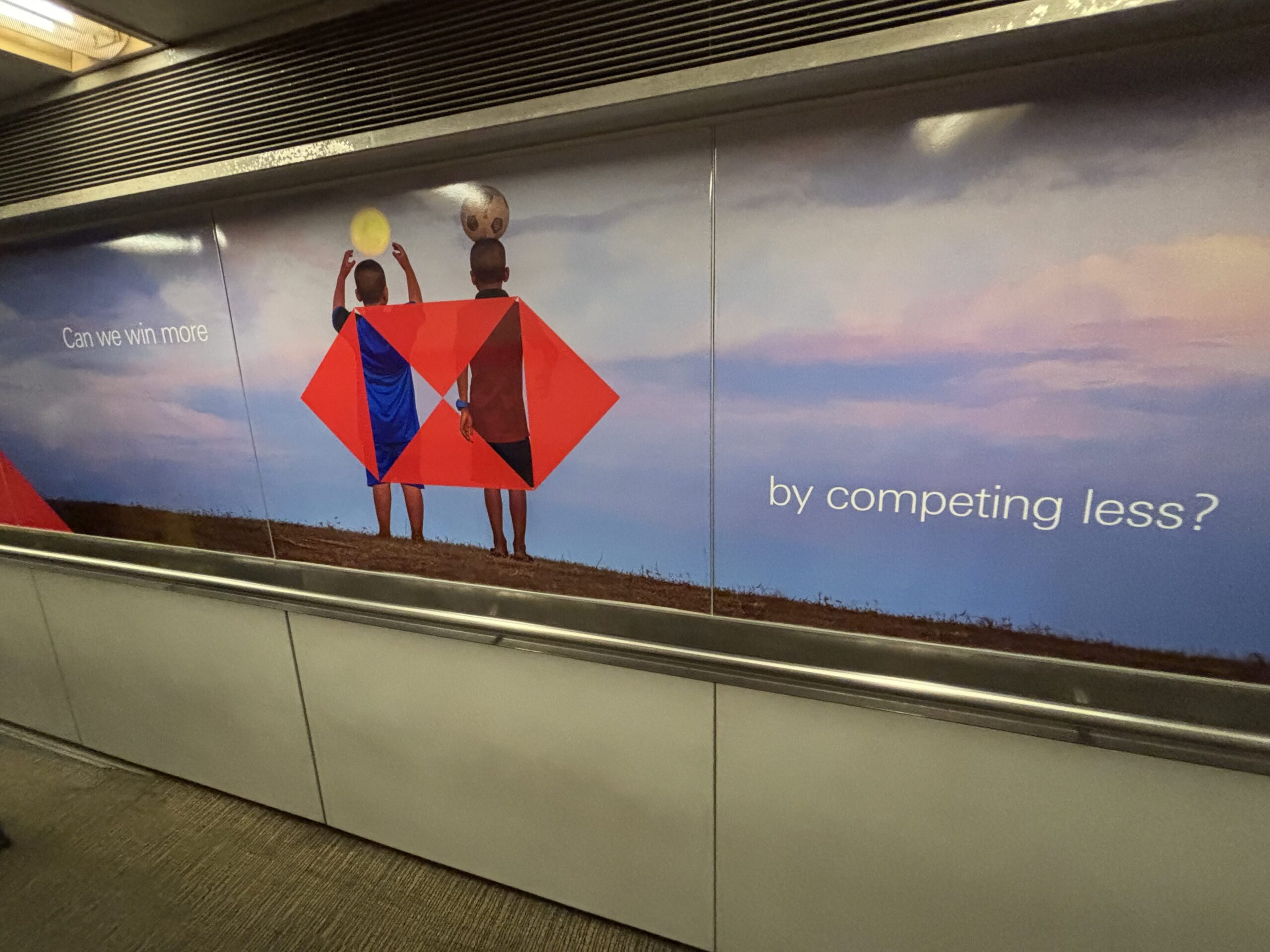
I thought this ad on an aerobridge recently was quite pertinent given the current tariff situation of the United States administration…
Living in subtropical South East Queensland, you get used to major weather events like heavy rain, flooding, and strong winds happening on a semi-regular basis.
So when you hear that a cyclone’s formed off the coast some distance away almost two weeks ago – at first you’d be inclined to dismiss the severity of it because few cyclones make it this far south.
Well… we’re in for a big one this week with Tropical Cyclone Alfred wandering down the coast for a while, but now making a cruel sharp westward turn straight for us!
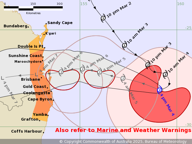
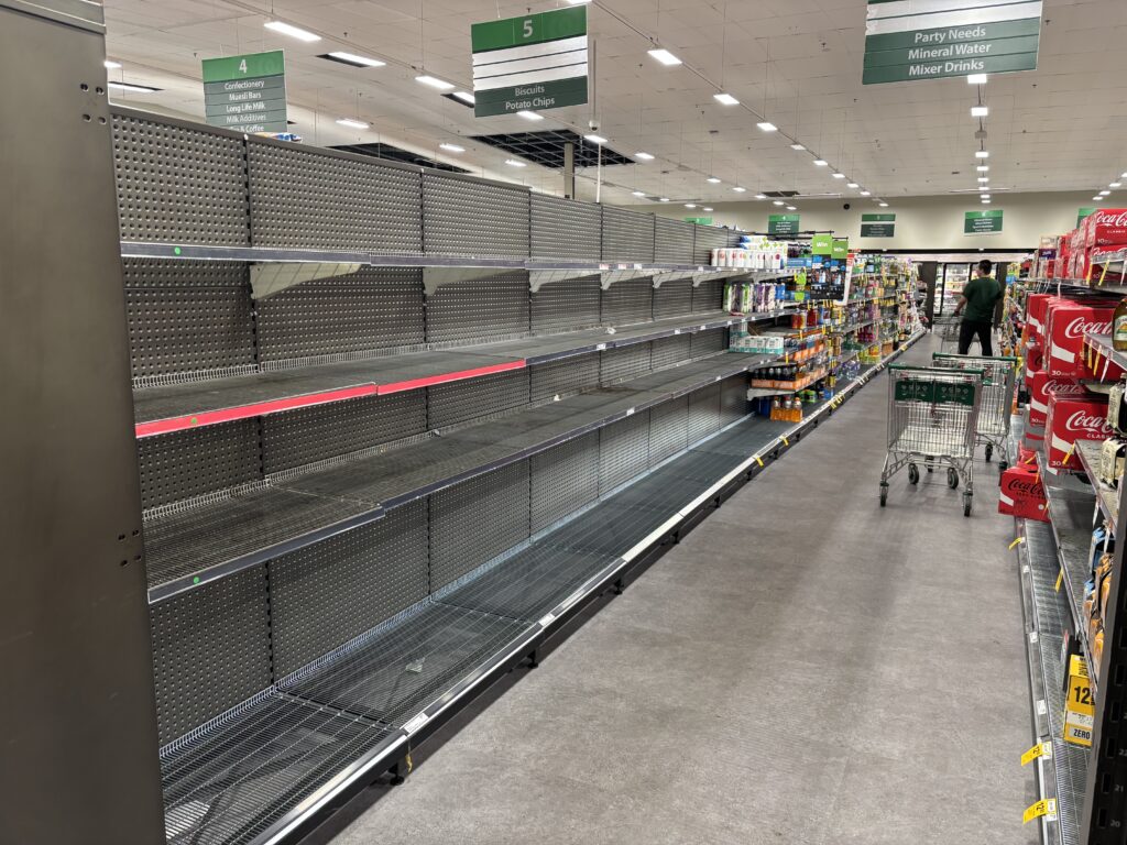
The last major cyclone to make landfall around South East Queensland was around 50 years ago, so naturally the population here isn’t used to it. Mild panic buying of water, batteries, even toilet paper (bringing back memories of COVID…) has set in, but otherwise things are orderly at the moment.
We’ve prepped my place a number of days prior – while we’re not at risk of direct flooding we are on a sloping plot so we put in some improved drainage and got some sandbags which has been fortuitous because apparently sandbag queues have gotten quite long over the last 48 hours and some places can’t keep up with demand.
Neighbours opposite us have actually completely cut down some ~4-storey-tall trees down, probably due to the high risk of flattening nearby houses and electricity infrastructure – which goes to show how seriously this is being taken.
I personally haven’t experienced a cyclone myself, so fingers crossed we get to the other side unscathed!
Stay safe everyone!
Reviewing my goal last year of getting back into blogging – it didn’t turn out that way mainly because of two reasons: work; and the WordPress debacle.
I had taken the first half of 2024 off from everything and was overseas for a fair bit without my computer, but I got back into the workforce in the latter half which chewed up a fair bit of time initially. Then the WordPress dispute kicked off around September. I won’t go into much about the dispute here, but since this blog runs on WordPress, I paused blogging while looking for an alternative but by the end of the year didn’t end up finding something as well run and integrated as WordPress.
As a result, I’ll stick with WordPress for now; I don’t expect it to disappear as such, but the legal mess isn’t exactly confidence inspiriring for the long term. I might still end up migrating the blog at some point – we’ll see how it goes.
This year’s resolution? I haven’t thought of one properly to be honest. Maybe “more in-person connections”? This does make me sound like I’ve always been some complete anti-social (I promise I’m just shy!) – but during my travels through the road trip and trips overseas last year, I had actually ended up stopping and talking to a larger number and more diverse set of people than I have in a long time.
It made me reflect on what my post-uni days have been like and while I’ve made a point of keeping in touch with ex-colleagues – of which I’ve been in a lot of catch-ups with in 2024 – my outside-of-work group has remained mainly static. I don’t expect to necessarily build more close friendships; going back to my trips last year – what I liked were the interactions themselves and sitting down to hear other people’s stories. Maybe it’s just me reflecting on the lack of “worldly” experiences in my 20s.
The EV road trip series will resume shortly – the next post is mostly drafted at this point. I do hope to be in regular blogging mode for 2025 and beyond!
I seriously didn’t think I would be using this title again a little more than a year later.
It’s graduation one day, moving countries the next – all for the purposes of going to University…but not for tertiary study. (Heck no. I think I need a break from 5 years of continuous study.)
If you just want to give this a try now, see the demo page.
A couple of days ago I was looking into the best way to make a custom grid pattern in the least number of HTML tags. The grid only had to be visual, so it didn’t actually need to contain any content (hence the desire to use as few HTML tags), but needed to have a grid that wasn’t just some ordinary square tessellation.
Turns out it’s actually quite easy to do this: CSS has multiple backgrounds and linear gradient capabilities for a few years now. What I hadn’t realised before this was that background positioning was also doable for each of the individual backgrounds. This turns out to be the key to doing this.
Then I thought – why not try applying this to vertical writing? Specifically, creating Japanese manuscript paper (known as 原稿用紙) that I could use on the web without the need for JavaScript to position the text into the “grid”.
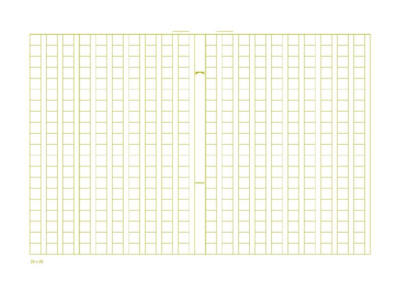
To replicate the grid, you only need four background layers (plus the white normalising background):
background:
    linear-gradient(to right, transparent 0%, transparent 1px, white 1px, white 0.5em, transparent 0.5em, transparent 100%),
    linear-gradient(to bottom, #CCECCE 0%, #CCECCE 1px, transparent 1px, transparent 100%),
    linear-gradient(to right, #CCECCE 0%, #CCECCE 1px, transparent 1px, transparent 100%),
    linear-gradient(to right, #CCECCE 0%, #CCECCE 1px, transparent 1px, transparent 100%),
    white;

background-size: 1.5em 1em;
In order from bottom to top (4th to 1st in the list of linear-gradients above), they are:
The background-size defines a width of 1.5ems, as each grid cell contains the character block (1em) and the line break to the side, which I’ve set to be half width.
All the definitions here are creating 1px wide lines (except for the mask which covers one half-width block in white), so there’s a need to position them or it’ll just be overlapping with each other:
background-position: 0 0, 0 -1px, 0 -1px, 0.5em 0px;
This also is able to work around the inability to specify gradient stops from the end of a linear-gradient. Simply overlay the “other end” of the gradient in the opposite direction and offset it (though this will probably fail to work perfectly for very complex gradients.)
Offsets of -1px are the default for the lines because the outer edges will be given by the border of the whole element, while the last of the vertical lines is offset by 0.5em to emulate the line break region. The mask itself is already aligned to this line break region, so there’s no need to move it.
That’s it. Extremely easy once you get how it’s composed.
Here’s the demo – and I’ve put in vertical writing as part of the grid, so you can see how full-width text fits into the square blocks. That in itself was easy with CSS’s revised writing-mode property.
I’ve enabled contenteditable on it so you can enter CJK (Chinese, Japanese, Korean) full-width text and it should fit! Plus you can print it out for your own use – enter some sample text and practice your handwriting on the printout!
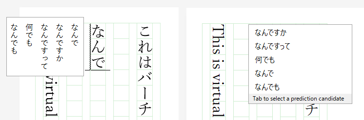
Out of the three Windows browsers I tested (Edge, Chrome, Firefox) – Edge seemed to have the best overall rendering and editing experience. (In fact, Internet Explorer has been supporting vertical writing longer than the other major browsers – since IE 5.5 more than 15 years ago!) Chrome and Firefox are pretty much on par, bar a few minor visual imperfections.
Also interesting was how the browsers handled vertical writing flows and keyboard navigation: Edge and Firefox follow the direction that you enter on the arrow keys, while Chrome follows the direction in the text direction as if you were handling horizontal text rotated 90 degrees clockwise (as in, [RIGHT ARROW KEY] would move down the page.)
In addition, input IMEs are handled much better in Edge and Firefox (left), compared to Chrome (right):
As a side note, I tried using flexbox for the layout, one: because I wanted to layout the page so that the explanatory text is on the right (while keeping the same HTML structure) and grid aligning to the right, and two: because it would allow for easier sizing of the containers, but unfortunately pretty bad rendering bugs with flexbox and top-bottom/right-left text flows meant that it broke the ability for scrolling when the “virtual paper” overflowed. Oh well – maybe browser vendors can fix this in a couple of years… I hope.
This will be short (by my standards) as I’m heading off to start the semester tomorrow when I’ve only just returned less than 48 hours ago, which also included missing Orientation and other things, so that’ll be fun!
I don’t think I can keep up with short-notice surprises on the first of every month, since you probably won’t believe me on April Fools (maybe?) and for the obvious reason that 12 surprises a year would evidently give a poor reader some form of stress-related heart attack[citation..?].
After my graduation from the Australian National University last year, I secretly came back on a mission which involved a bit of toing and froing between departments at the University of Auckland.
End result? I’m now officially a postgraduate student doing Software Engineering* there for at least a little while. Just as that was wrapping up, I jetted off to Europe – with fingers crossed for approvals for my courses which required concessions to be applied (and eventually they did.)
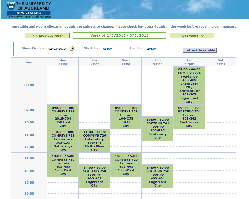
And just in case you’d like to stalk my jetlagged person around, here’s a handy timetable:
So…
* Technically it’s a bit more complicated than that, since they actually rejected my application outright the first time, so I’ve ended up having to do a bit of an odd pathway, which actually means I may end up being categorised under Computer Systems Engineering.
But the list of possible course choices are practically the same so I don’t see that being a high possibility. (Or who knows? I can be wrong, when I was not-so-pleasantly surprised with the declined initial application.)
After a couple of years of not maintaining a blog, I thought it was time to get one going again. It must be something like 5 years since I’ve last properly used one!
This is running on a Linode virtual instance somewhere on the West Coast of the USA and doesn’t have much at present (set up was only a couple of days ago.) Update: Much has changed since this was first written…