If you just want to give this a try now, see the demo page.
A couple of days ago I was looking into the best way to make a custom grid pattern in the least number of HTML tags. The grid only had to be visual, so it didn’t actually need to contain any content (hence the desire to use as few HTML tags), but needed to have a grid that wasn’t just some ordinary square tessellation.
Turns out it’s actually quite easy to do this: CSS has multiple backgrounds and linear gradient capabilities for a few years now. What I hadn’t realised before this was that background positioning was also doable for each of the individual backgrounds. This turns out to be the key to doing this.
Then I thought – why not try applying this to vertical writing? Specifically, creating Japanese manuscript paper (known as 原稿用紙) that I could use on the web without the need for JavaScript to position the text into the “grid”.
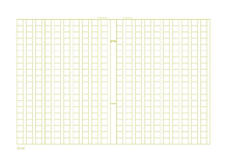
To replicate the grid, you only need four background layers (plus the white normalising background):
background:
    linear-gradient(to right, transparent 0%, transparent 1px, white 1px, white 0.5em, transparent 0.5em, transparent 100%),
    linear-gradient(to bottom, #CCECCE 0%, #CCECCE 1px, transparent 1px, transparent 100%),
    linear-gradient(to right, #CCECCE 0%, #CCECCE 1px, transparent 1px, transparent 100%),
    linear-gradient(to right, #CCECCE 0%, #CCECCE 1px, transparent 1px, transparent 100%),
    white;

background-size: 1.5em 1em;
In order from bottom to top (4th to 1st in the list of linear-gradients above), they are:
- Vertical line (one side of the column)
- Vertical line (other side of the column)
- Horizontal line
- Mask to cover the horizontal line in the line breaks
The background-size defines a width of 1.5ems, as each grid cell contains the character block (1em) and the line break to the side, which I’ve set to be half width.
All the definitions here are creating 1px wide lines (except for the mask which covers one half-width block in white), so there’s a need to position them or it’ll just be overlapping with each other:
background-position: 0 0, 0 -1px, 0 -1px, 0.5em 0px;
This also is able to work around the inability to specify gradient stops from the end of a linear-gradient. Simply overlay the “other end” of the gradient in the opposite direction and offset it (though this will probably fail to work perfectly for very complex gradients.)
Offsets of -1px are the default for the lines because the outer edges will be given by the border of the whole element, while the last of the vertical lines is offset by 0.5em to emulate the line break region. The mask itself is already aligned to this line break region, so there’s no need to move it.
That’s it. Extremely easy once you get how it’s composed.
Here’s the demo – and I’ve put in vertical writing as part of the grid, so you can see how full-width text fits into the square blocks. That in itself was easy with CSS’s revised writing-mode property.
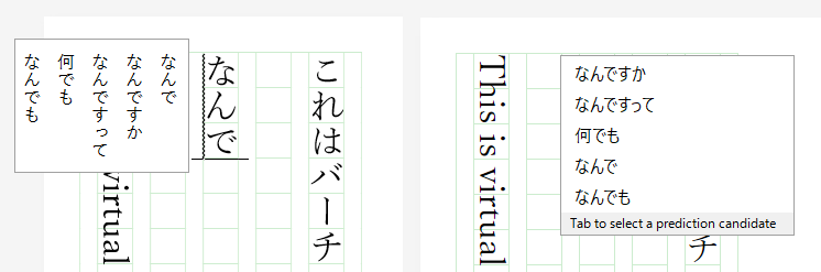
I’ve enabled contenteditable on it so you can enter CJK (Chinese, Japanese, Korean) full-width text and it should fit! Plus you can print it out for your own use – enter some sample text and practice your handwriting on the printout!
Out of the three Windows browsers I tested (Edge, Chrome, Firefox) – Edge seemed to have the best overall rendering and editing experience. (In fact, Internet Explorer has been supporting vertical writing longer than the other major browsers – since IE 5.5 more than 15 years ago!) Chrome and Firefox are pretty much on par, bar a few minor visual imperfections.
Also interesting was how the browsers handled vertical writing flows and keyboard navigation: Edge and Firefox follow the direction that you enter on the arrow keys, while Chrome follows the direction in the text direction as if you were handling horizontal text rotated 90 degrees clockwise (as in, [RIGHT ARROW KEY] would move down the page.)
In addition, input IMEs are handled much better in Edge and Firefox (left), compared to Chrome (right):
As a side note, I tried using flexbox for the layout, one: because I wanted to layout the page so that the explanatory text is on the right (while keeping the same HTML structure) and grid aligning to the right, and two: because it would allow for easier sizing of the containers, but unfortunately pretty bad rendering bugs with flexbox and top-bottom/right-left text flows meant that it broke the ability for scrolling when the “virtual paper” overflowed. Oh well – maybe browser vendors can fix this in a couple of years… I hope.